Illumination
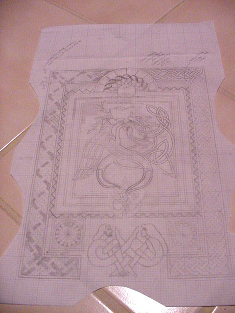
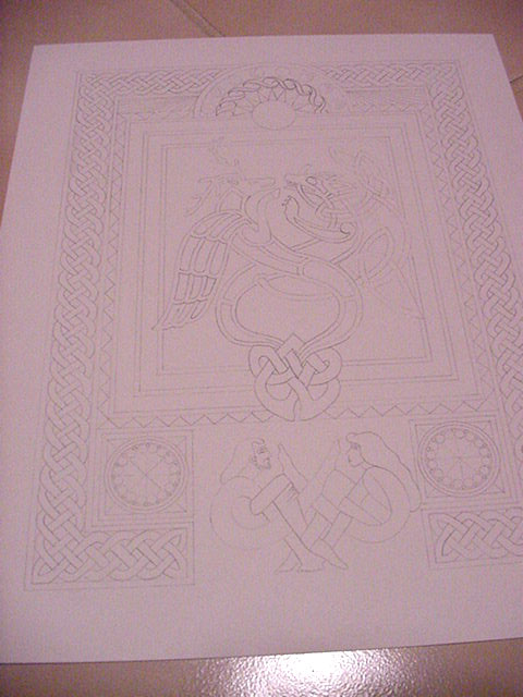
I finished sketching out my third illumination project and I'm getting ready to paint it.
The background art on this page is the second design shown below.
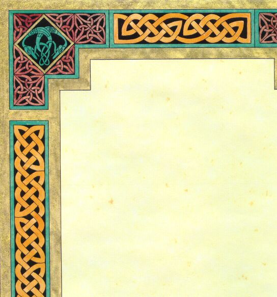 |
This is a Celtic Knotwork design with zoomorphics (the animals in the corners). (54K) |
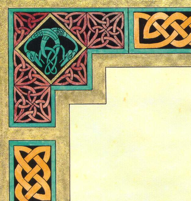 |
This is a close-up of one corner of the design. (66K) |
 |
This design I worked on for about a week, between trips to visit my dad in the hospital. I loved doing this design. (57K) |
| The corner design is an illuminated letter. It's the letter "O". It would become the first letter of the calligraphy that would fill the manuscript. It's going to be words by Hildegard von Bingen (12th Century nun) ... someday. (68K) | |
 |
This is the new design as done on drafter's vellum |
 |
This is the new design on bristol paper. |
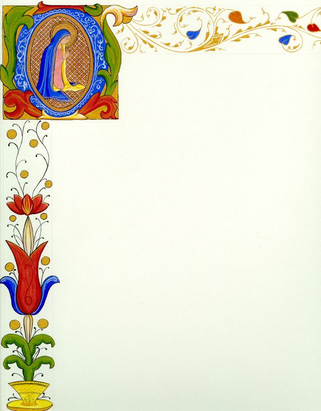
The first one was done "all wrong" by SCA definitions. I had no one to help me learn the "right" way to do this. It's done on modern parchment-paper that is artificially yellowed/aged. The black ink is permanent ink out of a bottle I had on hand from years ago. I Had drawn the whole design out on drafter's vellum and basically traced the design using a pen I dipped into the ink. I was able to trace it by putting a lamp under my glass coffee table. After all the black was done, I went back with colored inks of the same brand and just went over the whole thing, filling in the colors. The colors were transparent so I didn't have to worry about going over the black. The gold around the edge is also a liquid calligraphy ink that I bought in a stationey shop. About the only thing "right" is the design.
The second design was done after some training. The paper is white bristol paper (since I can't afford real lamb's skin vellum). I first lightly marked off the paper using a pencil. The design is what came out of my fingertips after looking at book after book of medieval manuscripts. I mixed my own paints using equal parts of dry pigment, glair, and water (except in the case of the gold -- which is gold gouache from a tube mixed with a little water -- gold leaf gets expensive too). Each of those "equal parts" is about the size of two or three drops of water. My paints were mixed on oyster shells and were completely reworkable when more water was added if they dried out (still are a couple of years later). All the paints were applied with very fine brushes (size 000 through 0 if you understand that sort of thing <g>).
I bet some of you are asking "What's glair?" Here's the recipe for glair: take an egg white and beat it in a glass or metal bowl, using a metal whip, into a nice meringue (skip the sugar, though). Now, beat it some more until you think you've way overdone it. Put a piece of plastic wrap over the bowl and set it aside for a day. When you come back to it, there will be some dry foamy stuff on top. Break the seal of that foam from the side of the bowl and pour the liquid under it into an empty film tube. There, that's glair. Do not refrigerate. Keep it with the rest of your artist supplies. Mine is dated 6/27/95 and is still good. It won't get moldy. It may stink a little, but that's okay. Now, what exactly IS glair. It is the glue that holds the dry pigments together. The water just makes them workable. Cool, eh?! Someday I'd like to grind my own pigments. The problems one can encounter with that is the toxicity of using real period materials. The dry pigments I use aren't overly friendly, but I'm very cautious -- no sneezing or heavy breathing with the lid open on those <g>.
I promise to do some more illumination, someday. I really do like it. When I do, I'll put the pictures here.